This project is part of The Odin Project curriculum, focusing on building a responsive admin dashboard layout using CSS Grid.
This project is from The Odin Project’s Course
Topics Covered
- Grid
- Positioning Grid Elements
- Describe the differences between tracks, lines, and cells.
- Position items by defining their start and end lines.
- Use shorthand notation.
- Advanced Grid Properties
- Create multiple grid tracks more easily using the
repeat()function. - Create grid tracks using
frunits instead of an explicit size. - Set minimum, maximum, and ideal track size boundaries.
- Use auto-fit and auto-fill to create a grid with a dynamic number of rows or columns.
- Use
auto-fit/auto-fillalong withminmax()to create responsive grids.
- Create multiple grid tracks more easily using the
- Flexbox and Grid Interaction and Use Cases
- Positioning Grid Elements
CSS Responsiveness Issue
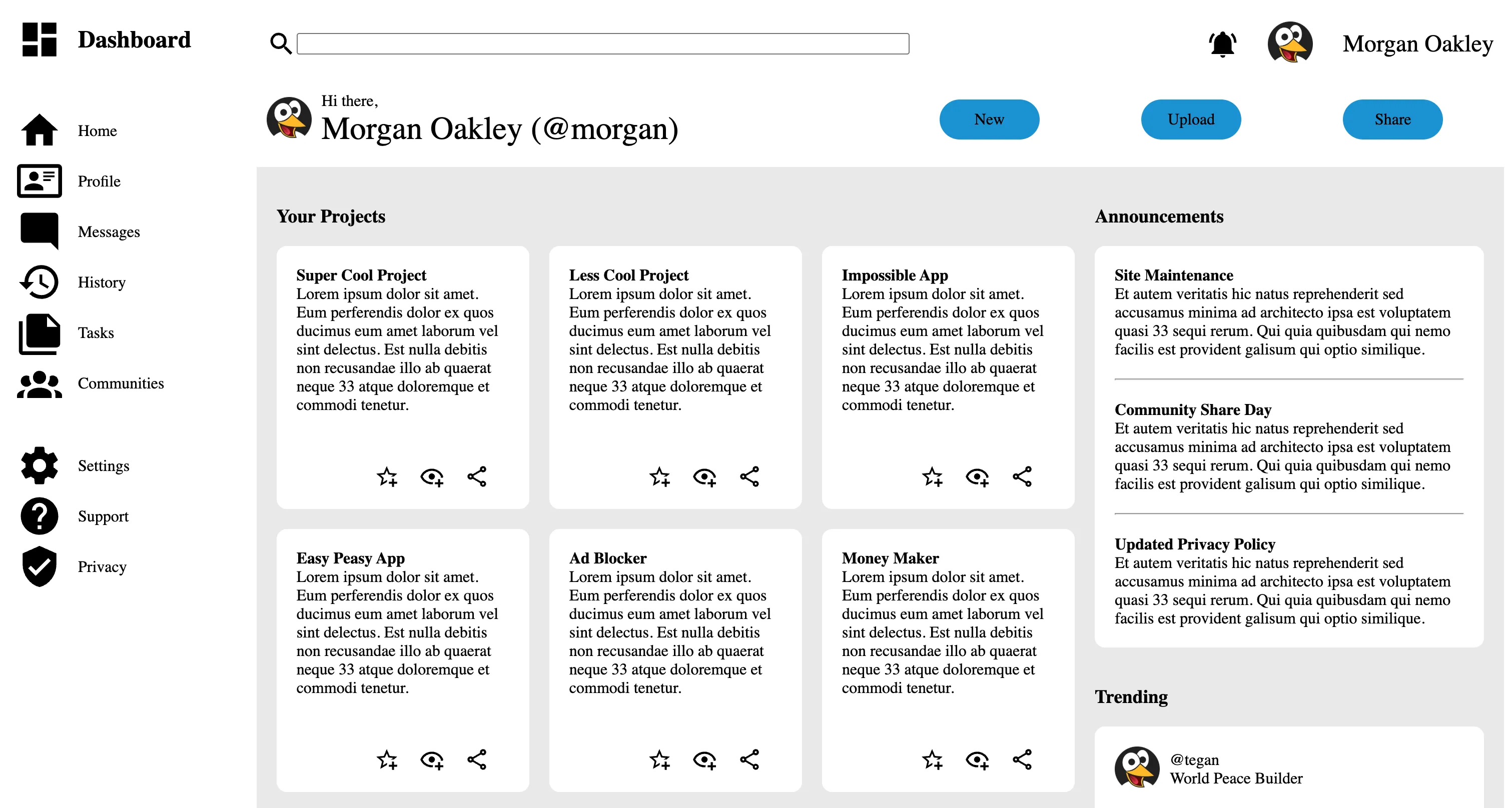
Please visit the repo to view a screenshot of the issue.
Responsiveness is still not where I want it to be for the webpage.
When the page is shrunk horizontally so that the Projects section shrinks to 1 column, there is a space that forms underneath the Announcements section.
The div.announce-sect itself gets too big even though the containing elements do not take up all the space. The sizing issue is most likely due to a grid interaction in row sizing. There is also a lot of grid nesting going on. I may look into fixing this interaction later.